Nuances of testing screen size based RWD
Layout based on browser size is the go-to option for RWD (Responsive Web Design).
Sizing elements knowing the viewport is much easier than figuring it out for different device sizes,
orientations, and pixel ratio. Sometimes, though, you will come across a site that uses something like
device-max-width CSS media query (now deprecated) or JS window.screen.width property instead of
max-width and window.innerWidth respectively.
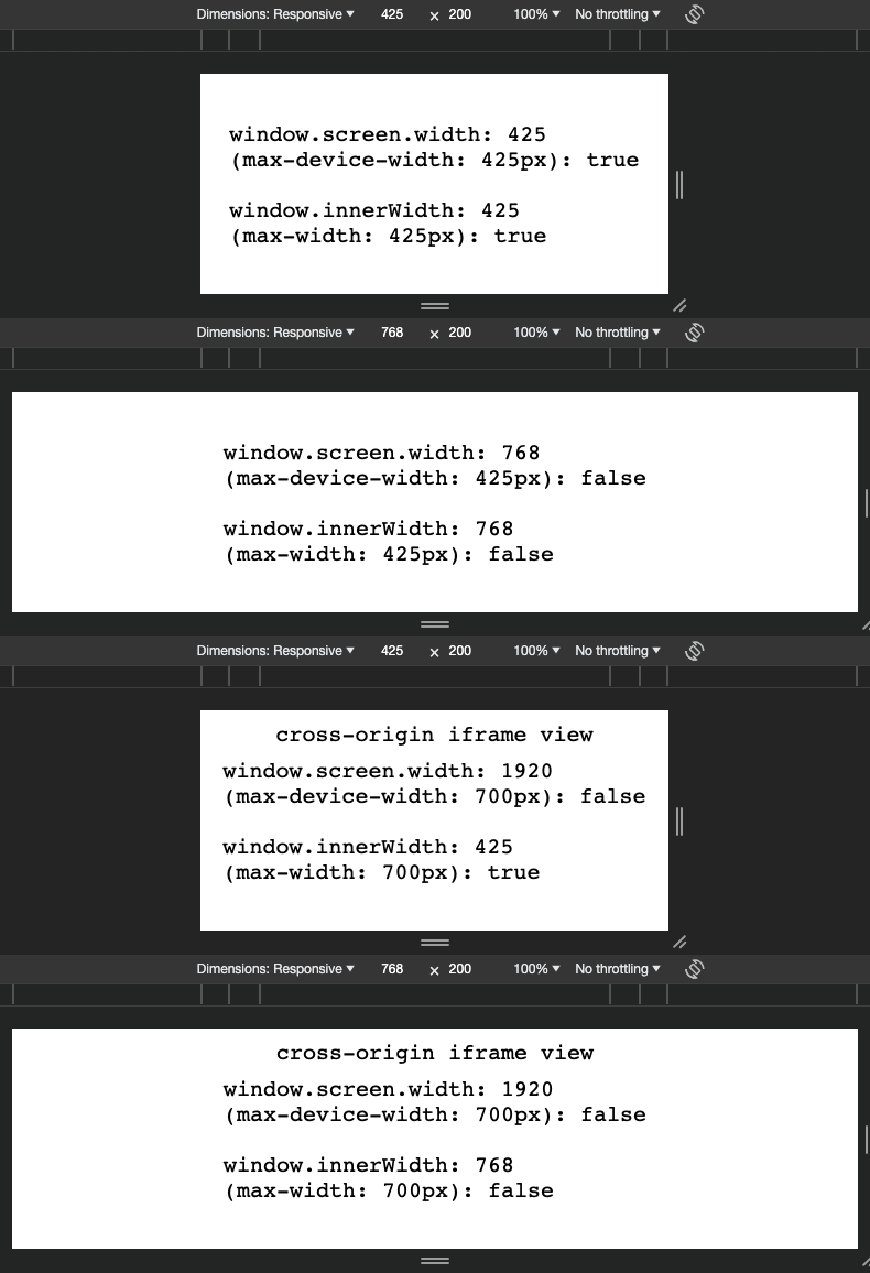
Testing width-based RWD is straightforward: resize the window or use browser DevTools' device toolbar with predefined resolutions. However, verifying the layout for device-width based RWD is more challenging.
Testing in Safari/Chrome/Firefox
For instance, Safari does not change the reported window screen size even in the Responsive Design Mode. Chrome and Firefox, on the other hand, are more useful as they propagate size change through the device toolbar in DevTools.
Furthermore, if you try to put an iframe over a cross-origin site, you're out of luck even with the DevTools.
Unlike touch-support, e.g., navigator.maxTouchPoints, the screen size change is not communicated to the iframe.
The tedious workaround is to change your display resolution or test on an actual or emulated device.

Some other puzzling behavior you might want to test is the swap of width with the height of a screen after orientation change on different systems (iOS/Android). The combination of all those nuances may even mislead you into thinking that the RWD is not implemented at all, albeit it is, but poorly testable.
