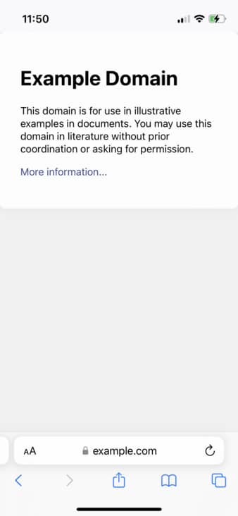
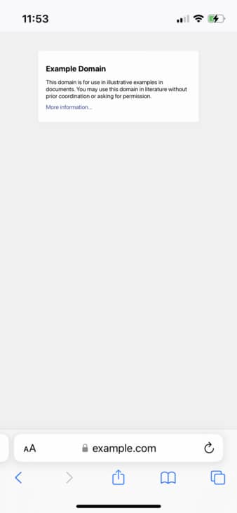
Testing different viewports on mobile browsers
During mobile tests and debugging on real devices you might find the lack of option to emulate different resolutions. The usual device toolbar is replaced with the device screencast. Without access to macOS emulation of Safari, or wanting to test the browser engine on Android with different media queries, you might wonder how to emulate a different resolution directly on the mobile browser.
A website developed with a responsive design in mind starts with an HTML meta tag that adjusts the viewport width to the device width. Without this tag, mobile browsers usually render the page with a virtual viewport bigger than the screen width. By forgetting this adjustment we miss the opportunity to fully take an advantage of media queries.
<meta name="viewport" content="width=device-width, initial-scale=1">
Modifying this viewport will allow you to emulate different resolutions on a mobile browser. If you already have the USB/remote debugging session, just open the console and run the following function:
function changeViewportWidth(width = "device-width") {
    document.querySelector('meta[name="viewport"]')
        .setAttribute("content", "width=" + width + ", initial-scale=1.0, user-scalable=yes");
}

changeViewportWidth(1920);


The corresponding height and device-height properties can be used whenever you need to test different heights.
Finally, if you need to decrease the viewport below the device screen, try to increase the initial-scale value (viewport/CSS pixel scale) to achieve the desired result.
